Header
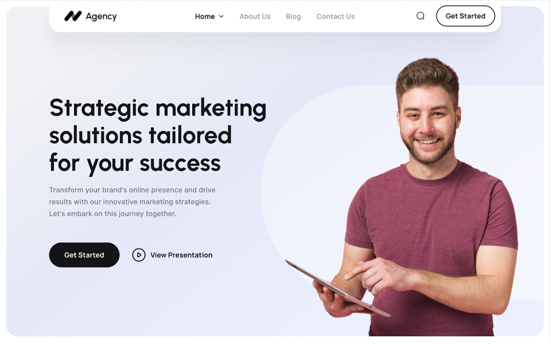
The header block aims to convey a sense of professionalism and expertise. It highlights the company's focus on providing strategic marketing solutions and encourages visitors to take action by either getting started or viewing a presentation. The design appears clean and uncluttered, allowing the key message and calls to action to stand out.
Company/Brand Name: Agency (likely located in the top left corner)
Navigation Menu: Home, About Us, Blog, Contact Us, Q (possibly a search function)
Call to Action Button: Get Started
Headline: Strategic marketing solutions tailored for your success
Subheading: Transform your brand's online presence and drive results with our innovative marketing strategies. Let's embark on this journey
Pricing Plan
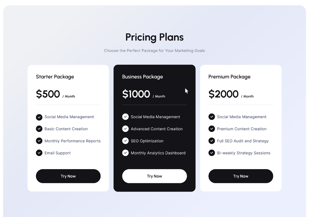
The pricing plan block effectively presents three distinct options to cater to different marketing needs and budgets. Three pricing cards displayed horizontally, representing the "Starter Package," "Business Package," and "Premium Package." The design uses clear typography, ample white space, and distinct sections for each package. The package names, prices, and call-to-action buttons are emphasized with larger fonts and contrasting colors to draw attention. Checkmarks are used to visually highlight the features included in each package.
Description grid
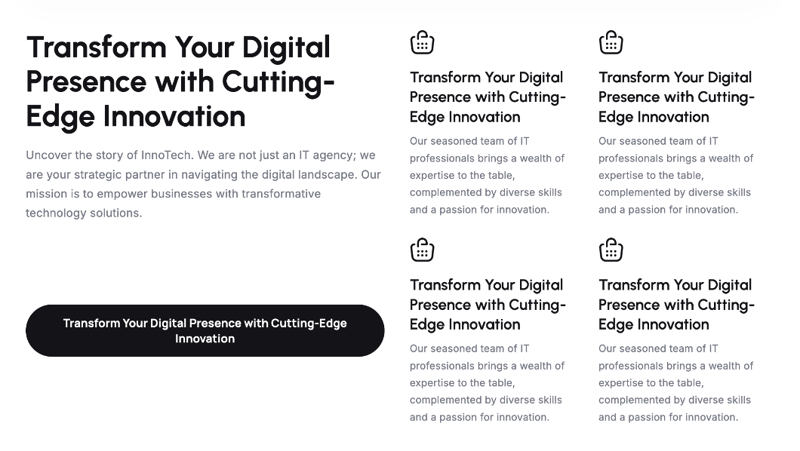
This description grid block provides a concise and visually appealing introduction to InnoTech, highlighting its key message and team expertise. The block uses a grid layout to present content in an organized and visually appealing manner. There's a mix of text and image placeholders (currently showing shopping bag icons) in the grid.
The design appears clean and modern with ample white space and clear typography. The repetition of the headline and team highlight creates consistency and reinforces the message. The use of simple icons and a lack of clutter contribute to a minimalist aesthetic.
Block with Title and card
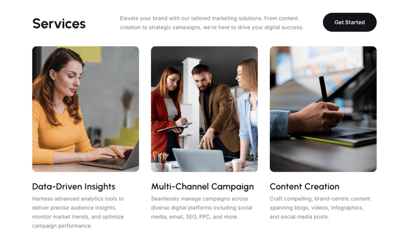
The layout aims for a clean and organized presentation of information. The use of cards makes it easy to scan and digest the content, while the visual elements help to break up the text and add visual interest. This structure is commonly used to highlight key services, features, or benefits in a clear and concise manner.
The title might introduce a range of services or features offered.
Each card could represent a specific service or feature:
- The icon/image would visually represent that service/feature.
-
The card heading would name the service/feature.
- The description would provide a concise overview of its benefits or details.
Cite block
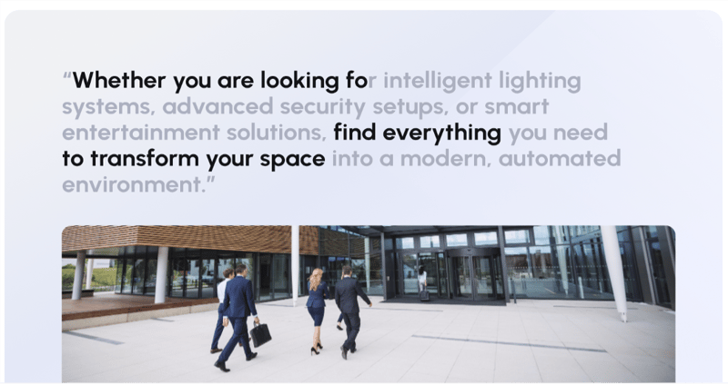
Serves to showcase testimonials, reviews, or quotes from satisfied customers or industry experts. It aims to build credibility and trust by highlighting positive experiences and endorsements
Hero
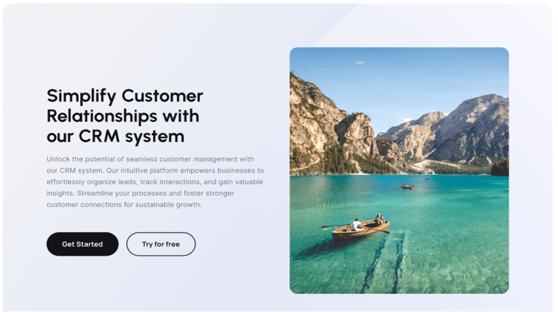
The hero block effectively combines visual appeal with concise messaging to introduce the product or service. The image evokes a sense of peace and clarity, metaphorically representing the benefits of using the CRM system to simplify customer relationships. The clear call-to-action buttons prompt the user to explore further.
The hero block utilizes a classic split-screen layout, dividing the space into two distinct sections. The left side is dedicated to text content, while the right side showcases a captivating image. The image takes up a larger portion of the screen, creating a visually impactful experience.
Custom Form
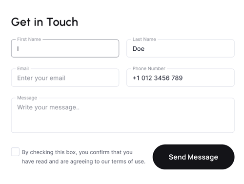
The form likely follows a clean and minimalist design with clear labels and ample spacing between elements for easy readability. Input fields may contain placeholder text to guide users on what information to provide.The submit button is likely styled with a contrasting color and clear labeling to draw attention and encourage clicks. The form likely has a title or heading above it, indicating its purpose (e.g., "Contact Us", "Get in Touch", or similar).
Fields: The form consists of multiple input fields arranged vertically.
Button: A prominent button is present, typically at the bottom, to submit the form.
Checkbox: A checkbox with accompanying text is included, likely for terms of use or privacy policy agreement.
Milestones
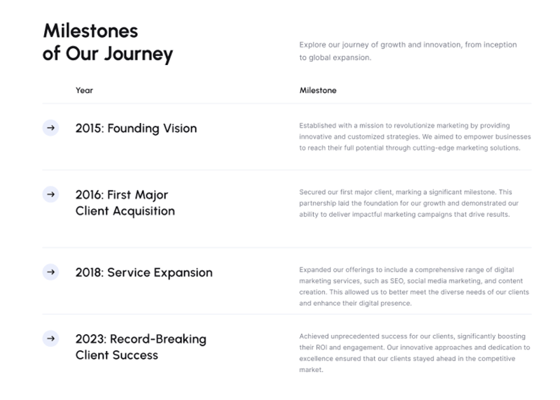
The Milestones block is likely designed to convey a sense of progress, accomplishment, and ambition. It serves as a visual representation of the company's history and its ability to deliver results. The clear timeline layout makes it easy to follow the company's journey, while the descriptive titles and paragraphs provide context and highlight key achievements.
- Highlight significant achievements and growth over time.
- Demonstrate experience and success to potential clients or investors.
- Create a narrative of the company's journey, showcasing its evolution and accomplishments.
Partners

The block presents a straightforward and visually clean way to highlight partnerships. The use of a neutral color palette ensures that the focus remains on the logos themselves.The logos are arranged horizontally in a row, suggesting a showcase of partnerships or collaborations. The logos seem to be evenly spaced, creating a clean and balanced visual presentation.
Reviews
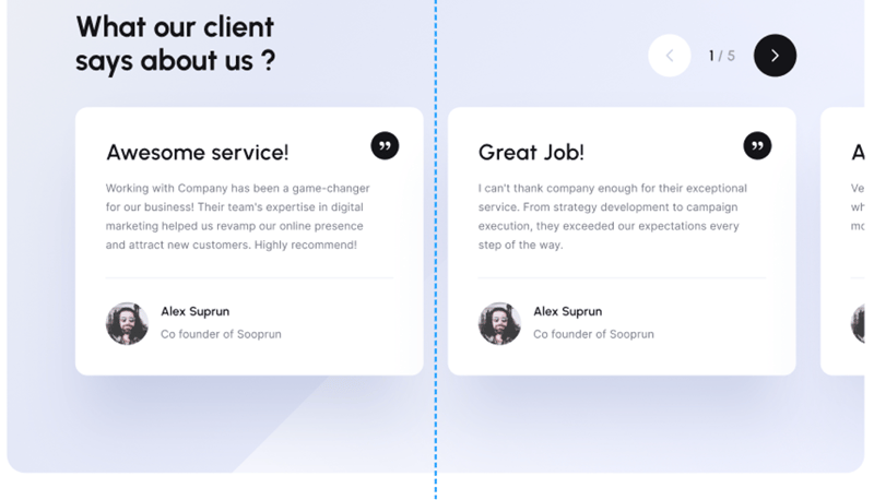
The Reviews block aims to leverage social proof to build trust and credibility. By highlighting positive experiences from past clients, it serves as a powerful persuasion tool to encourage potential customers to take action.
Each card features a prominent quote or testimonial text. The name and possibly title/company of the person giving the testimonial are included. A headshot or avatar of the reviewer is likely present.
Search result

The search result block presents a simple and intuitive interface for users to search for content. Its minimalist design prioritizes functionality and ease of use. Search Input Field is a rectangular input field with rounded corners, likely containing placeholder text to guide the user.
Showcase Slider
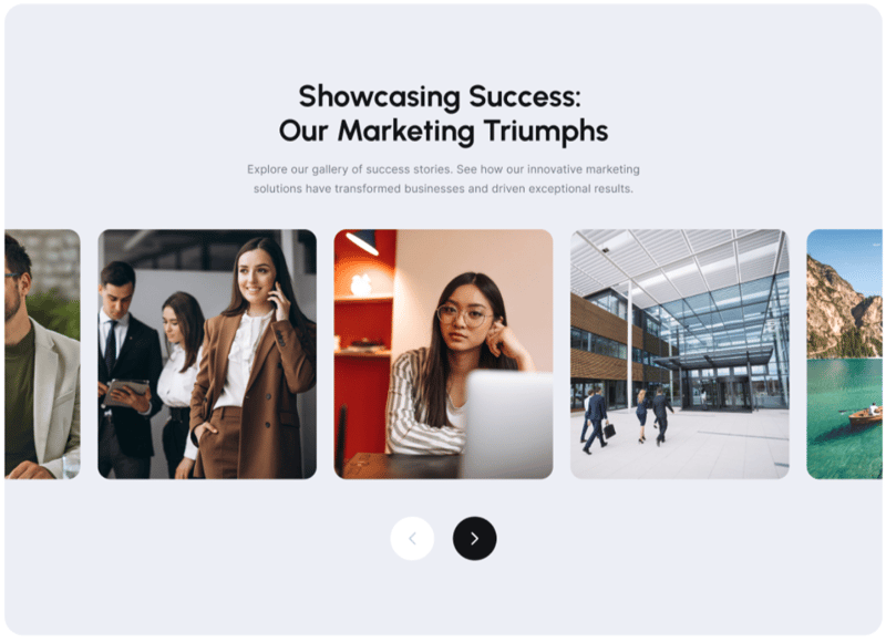
The Showcase Slider block appears to be designed to effectively highlight key achievements and create a positive impression on visitors. The use of visuals and interactive navigation elements makes it engaging and user-friendly.
The main focus is likely on showcasing visual content - this could be images, videos, or a combination of both. There might be accompanying captions or brief descriptions for each slide, although not visible in the provided image. The arrows suggest users can manually navigate between slides. There might also be dots or indicators to show the total number of slides and the current position.
Solution grid
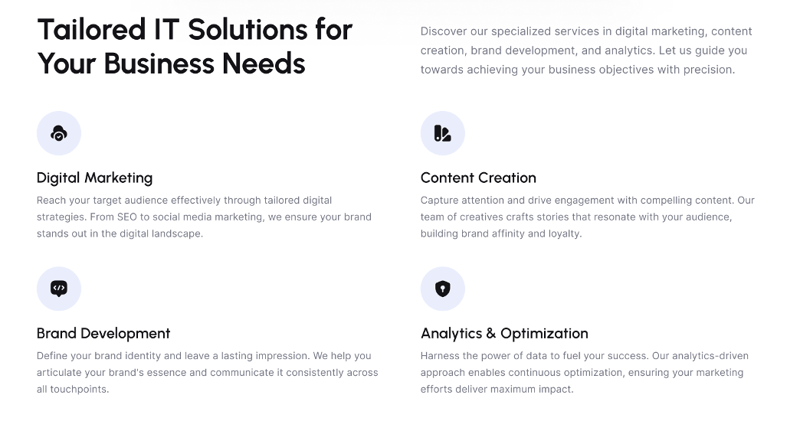
The Solution grid block aims for a clean and organized presentation of services. It helps visitors quickly grasp the company's offerings and identify areas that might be relevant to their needs. The use of icons adds visual interest and aids in differentiating the solutions.
Each solution is represented by a unique icon at the top, likely visually hinting at the service's nature.A concise title or heading describes the essence of each solution. A short paragraph or a few sentences elaborate on the key benefits or features of the particular solution.
Title/Title and Description Modules

The block aims to immediately capture the visitor's attention with a strong headline and provide a concise introduction to the company, product, or service. The visual hierarchy created by the font sizes and styles helps guide the reader's focus from the headline to the supporting details. It presents a clear two-part structure: a prominent title followed by a supporting description paragraph.
The arrangement is likely vertical, with the title above the description.
Contact Info and Social Sharing Modules
This combined block serves as a convenient point of contact for visitors while also leveraging the power of social media for increased visibility and engagement.It appears to have two distinct sections arranged either side-by-side or vertically.
One section likely focuses on contact information, while the other emphasizes social media sharing.
Social Sharing Section:
Social Media Icons: A collection of recognizable social media icons (e.g., Facebook, Twitter, LinkedIn, Instagram).
Sharing Functionality: These icons are probably clickable, allowing visitors to easily share the landing page content on their social media profiles.
FAQ
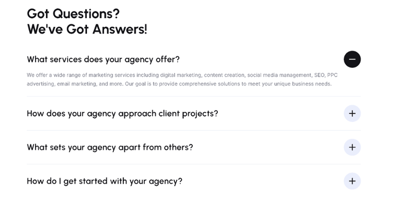
The FAQ block employs a user-friendly accordion design to present information in an organized and easily accessible manner. It helps address common questions and concerns, potentially improving the user experience and encouraging conversions.
A series of questions are presented, presumably addressing common inquiries potential clients might have.
The answers to each question are initially hidden but are revealed when the corresponding question is clicked.
Users can click on a question to expand and view the answer. Clicking again collapses the answer. The icons (+ or -) provide visual cues to indicate the expandable/collapsible nature of the content.
Blog List
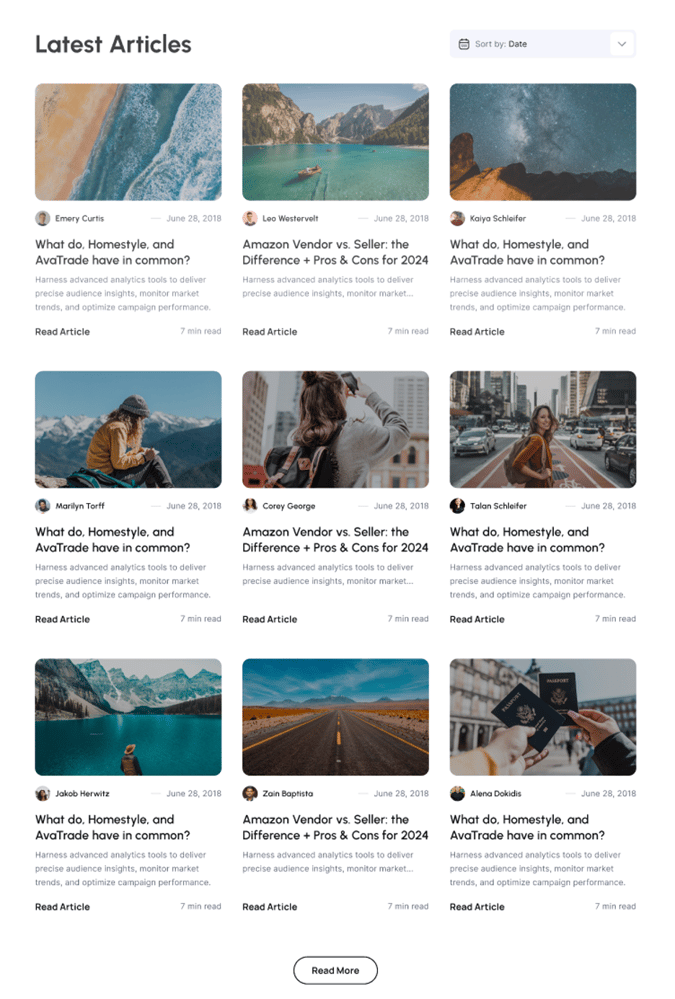
The block's primary function is to showcase a selection of recent or relevant blog articles.It aims to entice visitors to explore the blog content further, increasing website engagement and demonstrating thought leadership.
The block has a clear title, likely "Latest Articles" or a similar phrase, indicating its purpose. A dropdown or similar control, labeled "Sort by," suggests users can arrange the articles (likely by date, popularity, etc.). The articles are presented in a grid layout, probably containing multiple rows and columns. A button labeled "Read More" is present, likely leading to a dedicated blog page or section.
Article Card Elements:
- Each article card likely showcases a featured image relevant to the article's topic.
- A title or headline summarizes the article's content.
- Author name and publication date are displayed, providing context.
- A brief excerpt or description gives a glimpse into the article's content.
- A call-to-action button or link, possibly labeled "Read Article" or similar, encourages users to read the full article.
A 500 error page
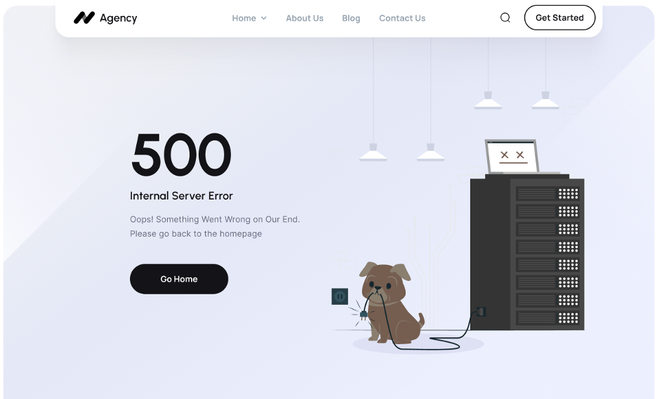
This 500 error page takes a lighthearted and approachable approach to a potentially frustrating situation. It uses playful visuals and friendly language to acknowledge the error and guide the user back to a functional part of the website.
A 404 error page
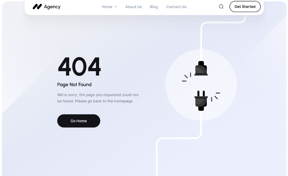
This 404 error page presents a clean and minimalist design, focusing on conveying the essential information while maintaining a sense of visual calm.The minimalist design avoids overwhelming the user with unnecessary information or visuals, allowing them to quickly understand the situation and take action. It maintains a professional look consistent with the overall website branding (as suggested by the header elements).
Page Header

The page header block aims to provide essential navigation and encourage user engagement while maintaining a clean and modern aesthetic. The block uses a horizontal layout to arrange its elements.It seems to be divided into two main sections:
Left Section: Likely contains the brand logo and primary navigation.
Right Section: Appears to house secondary elements like a search function and a call-to-action button.
The header serves to reinforce the brand identity and provide primary navigation for users to explore the website. The call-to-action button encourages users to take a specific action, like signing up or learning more. The search bar/icon enables users to quickly find specific content on the website.
Page Footer
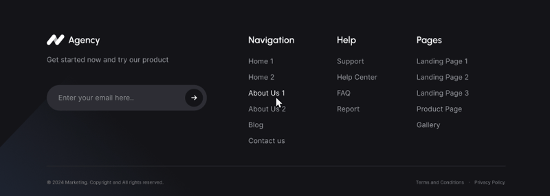
The footer block is well-structured and informative, offering users essential links and resources while maintaining a visually appealing design that complements the overall website aesthetic.
The footer is clearly organized into multiple columns, likely three or four based on the image. This allows for efficient categorization of information. The columns are arranged horizontally, spanning the width of the page.
The leftmost column probably features the company logo or name, possibly accompanied by a brief company description or slogan. One or more columns seem dedicated to navigation links, grouped under headings like "Navigation," "Help," and "Pages." These likely provide quick access to key pages within the website. A prominent element, potentially an email subscription field with a button, encourages user engagement. The bottom section likely contains copyright information, terms of service, and privacy policy links, fulfilling legal requirements.
© 2012-2024 Addax LLC All Rights Reserved
